
7 Design Trends We're Leaving Behind in 2026
Not every design trend is meant to last. Some ideas feel exciting when we first see them, but after they have been repeated in every new build, renovation, and Instagram post, they begin to lose what made them special in the first place.
As we move through 2026, we are seeing clients become much more thoughtful about what they bring into their homes. They want spaces that feel personal, comfortable, and collected. They don’t want rooms designed around whatever happens to be trending at the moment.
Here are seven design trends we are ready to leave behind, why they are beginning to feel dated, and what we would rather see in their place. This is not about declaring certain styles “wrong.” It is about creating homes with more warmth, individuality, and staying power.
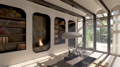
Why Design Trends Fade So Quickly
Design trends have a way of moving fast. We’re constantly exposed to the same ideas, whether on social media, in showrooms, throughout new construction, and eventually in big-box stores. Something that once felt fresh and inspiring can quickly become so familiar that it loses what made it interesting in the first place.
That doesn’t mean the original idea was ever wrong. More often, it’s simply been overused, watered down, or repeated without much thought. When every home starts to look alike, people naturally begin looking for something with more personality and authenticity.
At the same time, homeowners are becoming more intentional about the choices they make. They’re investing in spaces that feel comfortable, functional, and reflective of how they actually live—not just what’s trending at the moment. The trends that fade are usually the ones that prioritize novelty over longevity. The designs that endure are grounded in quality materials, timeless proportions, thoughtful details, and a genuine connection to the people who call the space home.
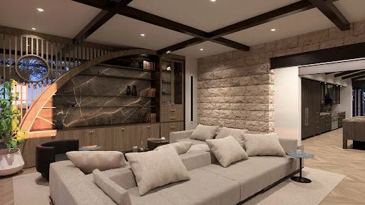
Excessive Skeuomorphism
Like many design movements, skeuomorphism had its moment. Mimicking real-world materials like leather, wood grain, and brushed metal once made digital experiences feel familiar and intuitive. But in 2026, those literal references feel more nostalgic than necessary. As users have become more comfortable navigating digital spaces, the need for interfaces to imitate physical objects has naturally faded.
Today's digital design feels much like today's interiors, cleaner, more intentional, and less interested in decoration for decoration's sake. Rather than relying on heavy textures or overly realistic details, designers are creating depth through thoughtful layering, subtle shadows, and refined typography. The result is an experience that feels lighter, more sophisticated, and easier to navigate.
Just as timeless interiors prioritize balance, proportion, and purpose over passing trends, modern web design is moving toward simplicity, clarity, and performance. Digital experiences that still rely on overly textured, skeuomorphic elements can feel visually busy and outdated, while cleaner, more considered designs create a stronger first impression and perform better for the people using them.
Overused Neumorphism
Neumorphism is another trend that has had its moment but is beginning to feel more like a design experiment than a lasting solution. Its soft, sculptural appearance and muted palette created a calming, minimalist aesthetic, but much like an interior that prioritizes style over livability, it often sacrificed function for the sake of the look.
As design continues to evolve, there's a growing appreciation for clarity and intention. Today's digital experiences are moving toward stronger contrast, cleaner definition, and interfaces that are welcoming and intuitive for everyone to use. The most successful designs don't ask people to work harder to understand them. Rather they quietly guide the experience through thoughtful hierarchy and visual balance.
It's the same philosophy that shapes timeless interiors. Beauty is important, but it should never come at the expense of comfort or usability. The designs that endure are the ones that feel effortless, balancing aesthetics with purpose in a way that makes everyday interactions feel natural.
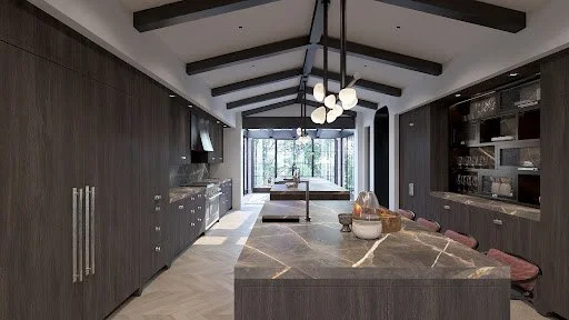
Generic Stock Photography
The era of the "handshake in a blazer" is over. Generic corporate stock photography, filled with staged smiles, anonymous boardrooms, and predictable business interactions, no longer resonates with today's audiences. Instead of communicating credibility, these overused visuals often signal a lack of originality and thoughtful brand storytelling.
Authenticity has also become a defining expectation. While many stock libraries have expanded their representation, staged diversity can still feel performative rather than genuine. Modern consumers are highly attuned to authenticity and can quickly distinguish between curated inclusivity and real human connection.
From a performance perspective, custom visual assets consistently outperform generic stock imagery. Original photography, bespoke illustrations, and brand-specific graphics drive stronger engagement, higher click-through rates, and create more memorable brand experiences.
The rise of AI-generated imagery has further accelerated this shift, giving brands the ability to create custom, on-brand visuals that align seamlessly with their unique identity. Rather than relying on recycled stock libraries, companies can now produce distinctive creative assets tailored to their voice, audience, and messaging.
Illustration-led branding has also emerged as a defining design trend, particularly among SaaS and technology companies. Custom illustration systems provide a cohesive visual language that feels ownable, scalable, and immediately recognizable, often replacing photography altogether.
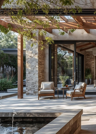
Overly Complex Gradient Meshes
Visual Noise Over Clarity: Multi-color gradient meshes often distract from core messaging and reduce readability of important text and calls to action.
Poor Brand Consistency: Overly complex gradients are difficult to replicate consistently across marketing materials, apps, and print collateral.
Slower Page Load Times: Heavy gradient graphics increase file sizes, directly hurting site speed metrics and SEO performance.
Return to Solid Color Blocking: Confident, single-tone color blocking is replacing busy gradients as a cleaner design aesthetic.
Duotone Simplicity: When gradients are used, designers now favor simple two-tone treatments over rainbow-style meshes.
Accessibility Contrast Issues: Gradient backgrounds frequently fail contrast checks, making text difficult to read for visually impaired users.
Autoplay Video Backgrounds
Full-screen autoplay video backgrounds were once considered the height of modern web design, but they are firmly among the design trends fading in 2026. They slow page load times significantly, drain mobile data and battery life, and often distract users from the primary call to action on a page. Many users also find unexpected sound or motion jarring and immediately leave the site.
Designers are shifting toward optimized static hero imagery paired with subtle micro-interactions instead. This approach preserves visual interest while keeping performance metrics and Core Web Vitals scores intact. As Google continues prioritizing page speed in search rankings, abandoning heavy autoplay video is both a design and SEO necessity.
Overly Minimalist Interfaces with Hidden Navigation
Confusing Hamburger-Only Menus: Hiding all navigation behind a single icon on desktop sites increases user confusion and drop-off rates.
Lack of Wayfinding Cues: Extreme minimalism without breadcrumbs or visible menus leaves users unsure how to move through a site.
Return of Visible Navigation Bars: Designers are reintroducing clear, labeled navigation to reduce cognitive load and support intuitive design.
Balance Over Bare Minimalism: Modern design aesthetics now favor "purposeful minimalism," keeping only what genuinely serves the user journey.
Improved Conversion Funnels: Visible calls to action and menus consistently outperform hidden ones in usability testing.
Mobile-First Navigation Patterns: Bottom navigation bars and tab systems are replacing ambiguous hidden menus for better mobile UX.
Overuse of Dark Mode Everywhere
Dark mode was a welcome innovation, but blanket application of dark mode across every single interface is one of the design trends we're leaving behind in 2026. Not every brand or content type benefits from a dark palette, and forcing it onto data-heavy dashboards or reading-focused platforms can strain user eyes and reduce comprehension. Context matters far more than following a trend blindly.
Instead, thoughtful designers are offering true user choice with seamless light-dark toggles rather than defaulting everyone into darkness. This respects individual accessibility needs and reading preferences rather than assuming one visual mode fits all users. The future of color trends lies in adaptive, user-controlled theming rather than one-size-fits-all dark interfaces.
Conclusion
Letting go of outdated aesthetics is never about erasing creativity; it's about evolving toward smarter, more human-centered design. The 7 Design Trends We're Leaving Behind in 2026 all share one thing in common: they prioritized visual novelty over genuine usability and accessibility. As we move forward, the most successful brands will be the ones that embrace purposeful, performance-driven, and inclusive design aesthetics.
Frequently Asked Questions
1. What are the main design trends being abandoned in 2026?
The primary design trends fading in 2026 include excessive skeuomorphism, overused neumorphism, generic stock photography, and complex gradient meshes. Autoplay video backgrounds, hidden navigation menus, and blanket dark mode usage are also losing favor. These shifts reflect a broader move toward accessibility, performance, and authentic branding.
2. Why is neumorphism no longer popular in modern UI design?
Neumorphism relies on low-contrast shadows that frequently fail accessibility standards for users with visual impairments. It also looks better in static mockups than in real, functional interfaces. As accessibility becomes a legal and ethical priority, high-contrast alternatives are replacing it.
3. Is dark mode still relevant in 2026?
Dark mode remains relevant, but forcing it as the default for every interface is what's being left behind. Designers now prioritize giving users a genuine choice between light and dark themes. Context, content type, and user preference matter more than blanket application.
4. What is replacing generic stock photography in design?
Custom illustration, authentic team photography, and AI-generated brand visuals are replacing generic stock imagery. These alternatives build stronger trust and better reflect a brand's unique personality. They also tend to drive higher engagement than recycled stock libraries.
5. Why are autoplay video backgrounds being phased out?
Autoplay videos slow down page load speed, drain mobile battery life, and can distract from key calls to action. They often frustrate users with unexpected motion or sound. Static, optimized imagery paired with micro-interactions now delivers similar visual impact more efficiently.
6. How can designers stay ahead of future design trends?
Staying ahead means prioritizing accessibility, performance, and genuine user research over chasing visual novelty. Regularly auditing interfaces against real usability data helps identify what's working and what feels outdated. Following credible design publications and testing with real users remains the most reliable strategy.
Our recent blog